99 components to explore
Browse AI interfaces, dashboard elements, forms, website sections, and motion components in a searchable visual library.
 UI component libraryLive
A library of 99 React components, with live previews, source code, and a connection for coding agents. I built Zeus UI to make the jump from finding a good interface to using it much shorter.
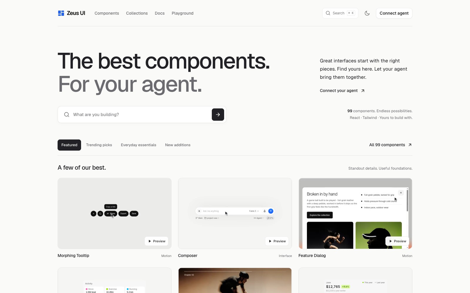
Finding a component is only the beginning. You still need to understand its behavior, find the right source, check its dependencies, and explain how it fits to the agent helping you build.
Put the visual catalog, component documentation, examples, and source behind one library. People can browse and try the components; agents can discover the same building blocks through MCP.
What the product brings into one place.
Browse AI interfaces, dashboard elements, forms, website sections, and motion components in a searchable visual library.
An MCP connection lets a coding agent find components and retrieve their source and usage examples.
Live previews and a playground show how a component behaves before it becomes part of your product.
Use the React SDK or the source installation workflow, with documentation and dependency information alongside the component.
Walk through the product, one step at a time.
Browse the catalog by the interface you are making. Open a component to see its preview, details, and related examples.
Decisions, boundaries, and the current state of the work.
Zeus brings discovery, documentation, previews, and agent access together. React and Tailwind CSS are the foundation of the component collection.